This page will give you some more information about the types of information you might need if you are running a similar “Evidence & Measures” project, as well as some anonymised examples of the information in the evidence packs.
Data Collecting stage
Most of the information we collected came from combining data from the Environment Agency and Northumbrian Water Group. We are grateful to these partners and all their help.
The Ouseburn project focused on phosphate. If the project were to focus instead on road runoff, or flooding perhaps – then probably completely different datasets would be needed.
 The first piece of advice is to, early on, make time to go into the offices of the key Environment Agency contact for the waterbody and together look through any potentially useful files and documents that may be stored in their system. Take a screen shot of some of the file structures! Then, you can ask the EA customer services generic inbox for your data requests – but at least you can frame better your requests, and you know you are not missing anything. Allow time to read this sort of information as it may point towards other reports etc. you may need to follow up on. The waterbody action plan is also a good starting point, as is any ‘investigations’ summary document that the EA may have about the waterbody.
My next piece of advice is to start an excel spreadsheet or access database of the datasets you are requesting and receive. This is a “data inventory” as well as a “GIS inventory” – so it can be tracked through (or tracked back) if queries arise. You have to keep this up to date as you go along, and I recommend you start it at the beginning of your project, it makes it easier than trying to retro-complete! Columns would include the date requested, the description of the data, the source, comments, access conditions, and date supplied. Then, when (if) if is used in a GIS project, the layer group, the layer name, the file name, the date added, the file creator (if it is generated from other sources etc.), and a contact name. If you are working with partners on this project, start a “version number” system and agree how you are all going to share / access / update this document (version control). Tip: as information is loaded into a GIS, check the grid references.
Bear in mind that some datasets you ask for will be confidential and so you will have to sign a special licence agreement for this. Allow at least 6 months for everybody to help you source datasets together. Use this time for building wider awareness of the project.
- Start to think about who from various organisations could be invited to the workshops – getting the right people involved takes longer than you think.
- Complete a ‘current situation‘ document to answer starting questions (you may like to keep adding to this over a few weeks as a way of collating information in one place).
- Collate former studies and other references into one place (some old paper documents may need scanning so make take longer than you think).
A pre-project survey (on survey monkey) among stakeholders is also a good idea. Make the questions broad enough to be repeatable after the project, leave free text fields for comments which can be useful, and make the first question be the person’s name (so you can track down interesting comments).
The water company may have a list of ‘wrong connections’ investigations, it may also be called ‘polluted surface water outfall programme’, which can be requested. They should also be able to release a list of locations where there has been capital investment in the last 5 years. Details of the next 5 years may be delayed because of Ofwat clearance / confirmations.
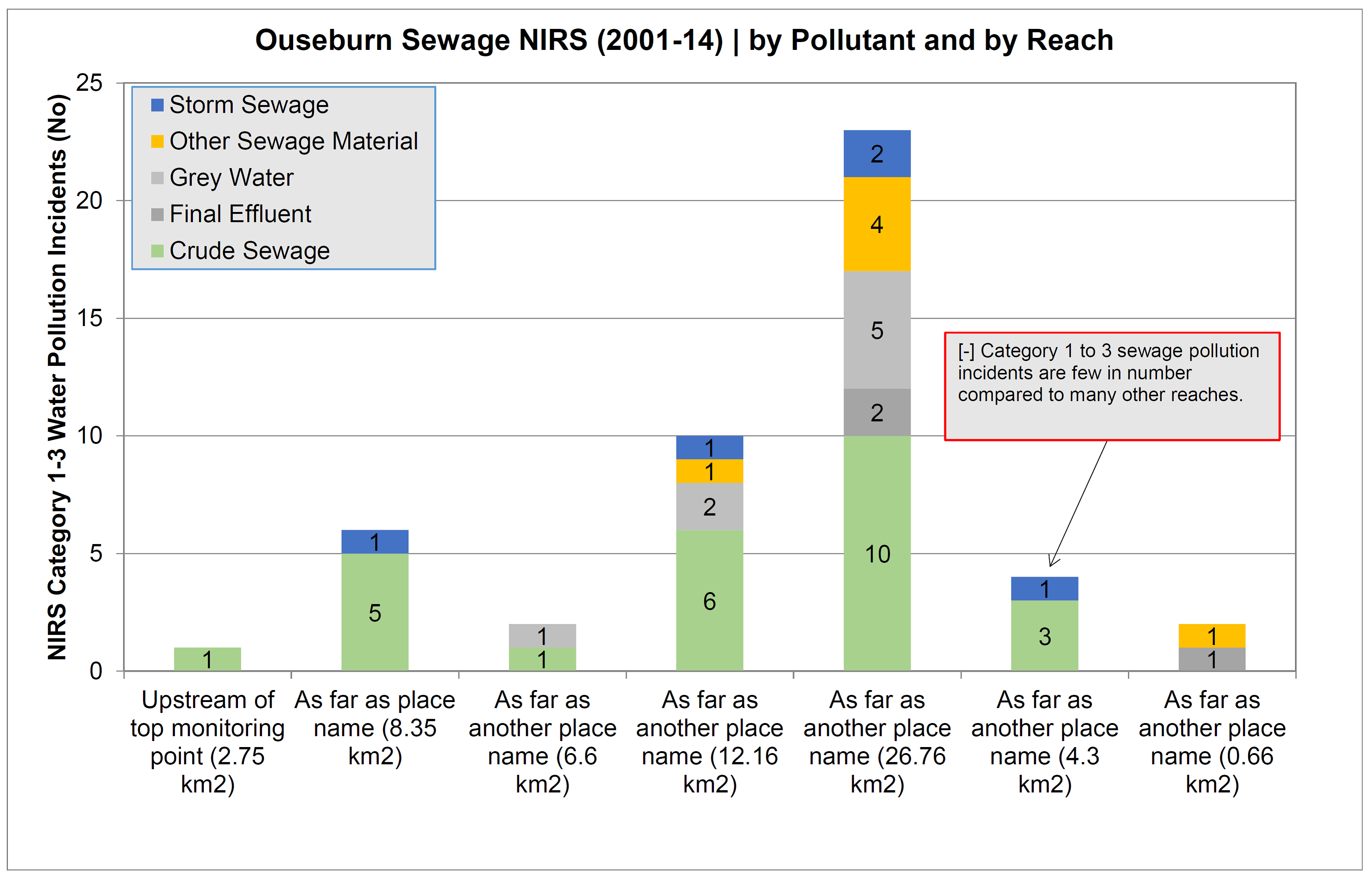
The basic concept of the Ouseburn project was looking at phosphate and trying to pin down its cause. Phosphate levels recorded at all times, regardless of rain etc would point towards one suspected cause. Levels that show a pattern in the time of day or day of the week would point towards something else. And those that spike during heavy rain add evidence to another suspected cause.
As so much of the data will come as spreadsheets and even pivot tables, you might like to look for an advanced excel training course or similar, during the early stages of the data collection. Did you do A-level maths? Do you understand logarithmic scales? Also, if you don’t have a background in chemistry, start learning key acronyms like NH4 is ammonia! Keep a list of acronyms as you go. One more tip, “unionised” ammonia is nothing to do with being part of a union, it is actually pronounced “un-ion-ised”!”
A list of the datasets we used in the Ouseburn Evidence & Measures project can be downloaded here.
Scope
Another key task to work on at an early stage is to agree the scope and the focus. This might be only part of a particular waterbody, or to focus on one particular issue. On the Ouseburn we focused on phosphate but for the whole waterbody – which was a huge task. We also had to decide how to break that waterbody down into meaningful reaches.
Another way of considering scope is to think about time. After our ’causes’ workshop we had feedback that data from before 2006 was too old for our topic – phosphate. You might like to have this type of discussion with stakeholders before bringing together all the evidence packs – although a focus on a different type of pollution may well need a longer view.
Conceptual diagram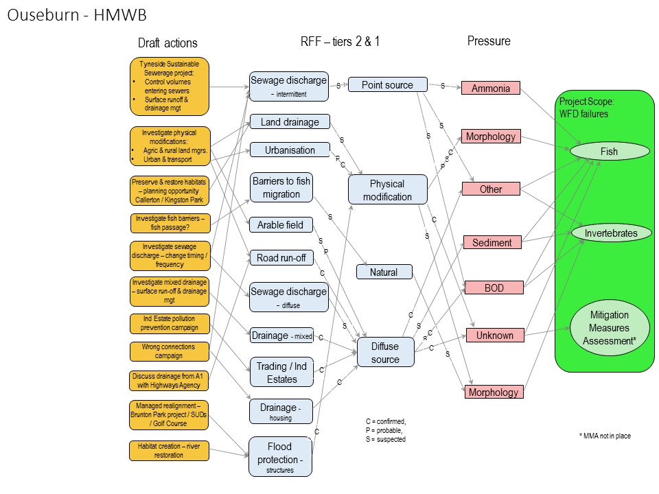
One task that can be progressed while the data gathering is going on, is a conceptual diagram. This is a way of illustrating all the ‘confirmed’ and ‘suspected’ issues affecting the waterbody. The Waterbody Action Plans are the basis for this, and are really useful. Here is a copy of the conceptual diagram for the Ouseburn.
Build the diagram working right to left. Start with the WFD failures, then list the pressures, then the “reasons for failure” and finally the draft actions. Our template was in Powerpoint. At the workshops, its elements can be revealed (right to left) during a presentation. You may like to build a second version, for the parts that are only relevant to the agreed focus of the project, which may be simpler to look at.
Maps
We started building the map project as data started arriving. The two consultants and the Tyne Catchment Co-ordinator worked together. We used QGIS mapping software (open source) which we were already familiar with. We found that by agreeing on a file / folder structure, we could share a project between us. The project simply opens the files in the same folder relative path as it was when it was saved. So, if the project thinks that the map data relating to sewers is in folder, “Input Data” and “Sewers”, then all three of us had it saved in the same place.
It was agreed that the Tyne Catchment Co-ordinator would make updates on a Friday, the two consultants during the rest of the week. Last thing on a Thursday, or at the end of the Friday the project file (together with any added GIS shape files, zipped up) were shared on email, with an updated “version” number. This way, only the project itself and not its whole data needs to be emailed around, otherwise it would soon get too big to email. (An alternative would have been to use dropbox).
One piece of advice is to all make sure you download the same version / most recent version of the Ordnance Survey ‘open data’ base mapping, as the colour symbology seemed to change between shared projects if we weren’t all using exactly the same base maps. Took us a while to work that one out!
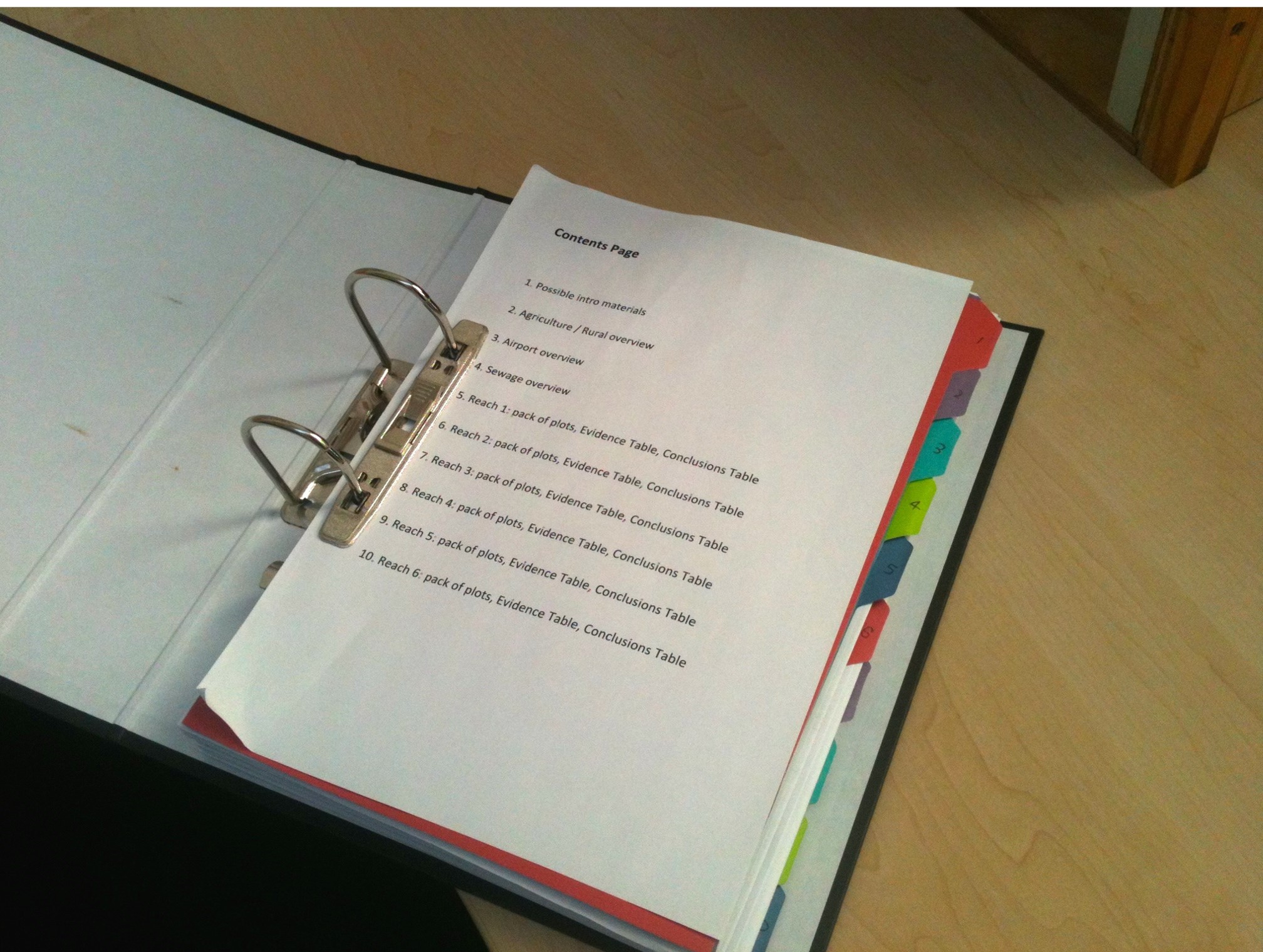
Evidence Packs for the workshops
One lesson we learned from the Ouseburn project, is that it could have saved some time at the workshops by holding a pre-workshop meeting. This would have included one key person from each organisation, with time to go through some of the data (graphs) in detail. This person can then feed back to their colleagues. This would save time at the workshops (when 20-odd people are in the room) as they can immediately trust in some of the conclusions the data pointed towards, without having to question the detail as closely, in the knowledge that their colleague had already done that. You may also get useful feedback on what timescale for data sources certain organisations would reject, for instance if going back further than 10 years may be rejected by certain stakeholders for certain data sets.
For the Ouseburn we divided the waterbody into 7 reaches. These were based on the main Environment Agency monitoring points, and around that, sensible geographies e.g. the edge of distinct housing areas, or roads, or informal ‘reach’ dividers that others had already mentioned or developed. We were delighted that our mapped reaches have now become a ‘currency’ of shared understanding between partners, as well as new delivery project partners in this area.
Each reach, as well as three additional focused ‘topics’ (airport, rural issues and sewage) had a set of maps or charts (each on a separate worksheet tab). Download here a guide to the charts with anonymised examples. Where a student project or other study had collected additional data, it was inserted into the relevant ‘reach’ section at a logical point in the above list of graphs and charts. Some reaches had additional graphs on relevant topics.
Evidence tables
Also in the evidence packs, for each reach, was an evidence table. This was structured according to the reasons for failure in the conceptual diagram e.g. agriculture, sewage, urban areas – and so on. For this task we used an excel spreadsheet.
Each topic included details about what the data show us – basically conclusions from the graphs (or other quotes etc from studies) are listed. They are marked with either a plus sign for supporting evidence, a minus sign for opposing evidence or a zero for uncertain, so [+] or [-] or [0], or [NE] for no evidence or [NA] for not applicable.
Each ‘line of evidence’ had sub-headings about variation in space (e.g. land use – data from the maps), variation in time (data from the graphs / charts), as well as ‘other’. The Ouseburn’s threats to target biology boiled down to 5 sub-headings: Agriculture, Sewage, Transport, Urban Areas and Other.
- Here is an example of one of the evidence tables prepared for the causes workshop
- The key points from this were then transferred to a ‘conclusions’ table for each reach – this also considered the consistence of the evidence, and draft conclusions, ready to discuss at the workshop
- Between the workshops, the evidence tables were revised and added to (see below)
At the stage where one key person from each organisation comes together to look at the data, you may be able to agree what the key lines of evidence are, for the chosen focus. That way, not every ‘reason for failure’ is relevant. For instance, transport is not as relevant for a phosphate project. Some of these ‘red herrings’ then don’t have to be included at the full workshops, which might otherwise send people down misleading lines of thought! In the Ouseburn case, early evidence showed us that inputs from septic tanks were insignificant and there were very few properties that were more than 100m from the sewer network. However, because it was a line in the evidence table, at the end of the workshop, people flagged it up on post-it notes as an important issue!
After the causes workshop and before the measures workshop, revisions were made – to incorporate participants’ comments and any agreed revisions (we used a different colour text to highlight the revisions). Also a conclusions of the evidence table was added, with all 7 reaches on one page. This had a column summarising the estimated orthophosphate load for each reach (as a % range for the whole waterbody), as well as 4-5 main conclusions for each reach. This is a useful reminder when people come together again at the Measures workshop.
One of the tasks towards the end of the Causes workshop had been to score each of the elements based on the evidence available – from 5 (significant evidence) through 3 (evidence uncertain) to 0 (enough evidence to identify that the element is not a threat). We used post-it notes for this task, working first individually and then inour small groups. These scores helped form the conclusions summary tab.
Measures workshop
The measures workshop was held only a few weeks later – to keep momentum and focus going – this also gave delegates time to gather any supporting information or clarifications that had been requested and submit it to the Evidence and Measures team. We started with a quick refresher.
There may still be differences in opinion around the room on the main threats to water quality.
The focus of the day is no longer to delve into the data, but for each agreed topic, to draft an Action Table. We again worked in small groups, each group had a conclusions summary for each reach, a large map, the revised evidence table, the original evidence packs (lever arch file). Our three groups were focused on the topics Waste Water; Agriculture & Land Management; and Strategic Overview.
The measures we were asked to come up with had to focus on the available evidence, had to be specific in terms of exactly what and where (so that it is possible to have two identical measures but in different places). If evidence was not clear or contentious, then we could come up with actions that would help provide clearer evidence. Finally, we could note issues to be ‘parked’ and dealt with later.
We drafted the action table using a spreadsheet and then each group’s spreadsheet was merged into one. You can download it at the bottom of the main ‘Ouseburn Investigations’ page. The first column is an ID number. One tip would be to double-check this as the spreadsheets are merged – the action description may cross-reference to ‘item 2’ whereas the number may now be ‘item 38’!!!
There are a lot of columns to try to fill in on the measures spreadsheet – some of the columns were more critical than others. We scheduled in coffee breaks and each group just kept working through the breaks, and then fed back to the whole room.
Moving on into action
We formed some task-and-finish groups to start overseeing some of the key actions. This was within a few months of the workshops. We also repeated the same survey with stakeholders that we had run at the start, as a way of evaluating the whole process.
“I strongly feel the Ouseburn E&M project has helped to guide and prioritise issues. it has brought the right organisations and people together to begin to jointly tackle these issues.”
“I feel that we are a lot more joined up than we were, working in less isolation.”
“So far, this project has the most joined-up approach of any that I’ve been involved with. That is quite an achievement considering the range of agencies involved.”
Useful contacts
Contact Paul Hulme at pjhydro on paul.hulme@pjhydro.co.uk
Contact Nick Rukin at rukhydro on rukin@rukhydro.co.uk
Contact the Tyne Catchment Partnership co-ordinator on tynecatchment@tyneriverstrust.org
Contact the Defra specialist on the Evidence & Measures project on victor.aguilera@defra.gsi.gov.uk